Cancer Rate Charts
Last month, I saw some graphs about cancer rates post COVID with people in saying (but giving themselves plausible deniability) that the vaccine caused a huge spike in cancer rates. They didn’t cite their sources and the graphs themselves weren’t identifiable as coming from a specific place, so I went to the National Cancer Institute’s website to look at the data.
1978-2022 Cancer Rate per 100k Population
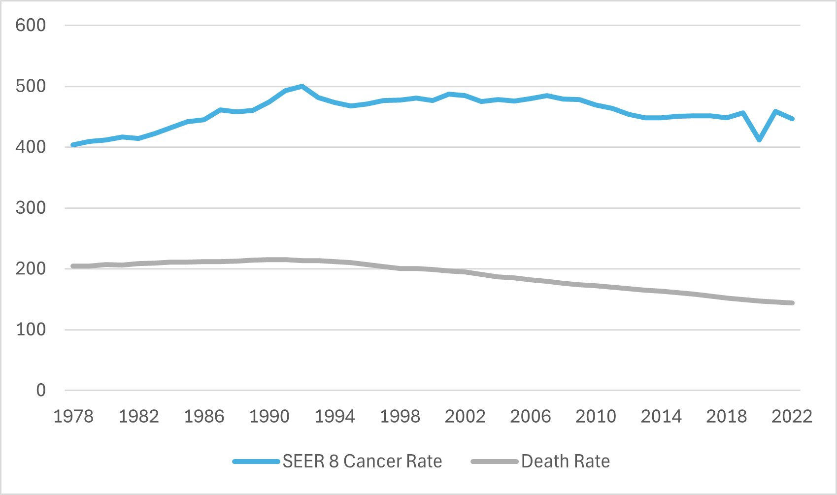
There is only data through 2022 because cancer incidence takes 22 months for the NIH to compile, which seems very long to me but ostensibly it is because they are being thorough. The significant drop is in 2020, my guess is that screening dropped off significantly in that year, but that’s just a hunch. Maybe 45 years is too many look at all at once except to see the broadest of trends.
Here’s just the last 13 years.
2009 to 2022 Cancer Rate per 100k Population
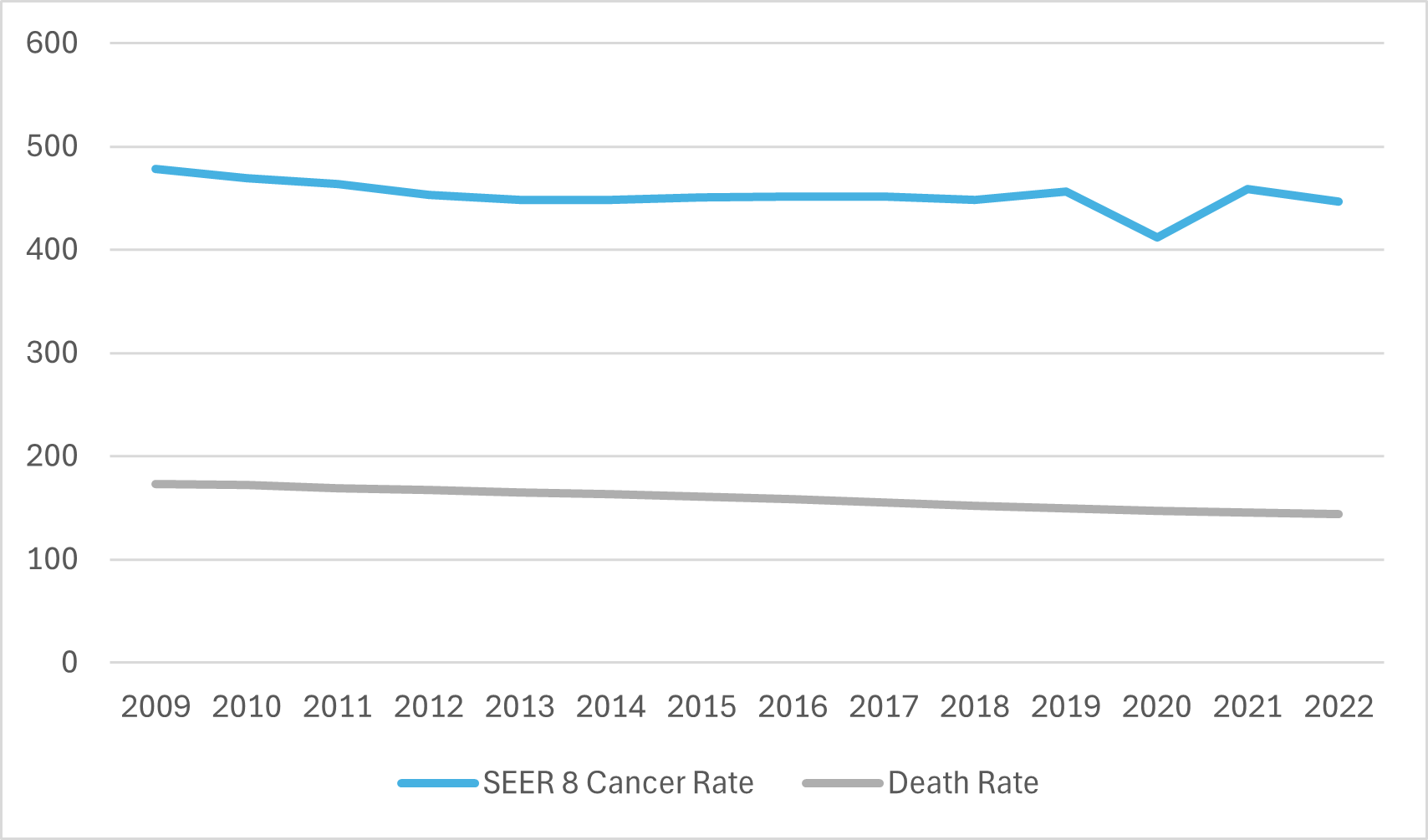
To me, this at least seems like a big nothing burger. Death rate from cancer is slowly decreasing over time mostly like it has been for close to 45 years. So if this is the information, what about the graphs that I saw?
They changed the axes of some of the charts so they didn’t start at zero and mucked around with the years so that they were comparing disparate years and axes with the whole purpose of making the variation in numbers seem more drastic than it is.
Doing this unintentionally is bad form, doing it on purpose is lying.